Charts in Dashboard help you turn feedback into clear, visual insights. With the latest update, the chart settings experience has been redesigned to make editing faster and more intuitive.
If you’re looking for the Settings button and can’t find it—you’re in the right place. All previous functionality is still available. It’s just organized differently.
What changed?
With the new experience:
- Settings are now organized into multiple icons.
- Each icon represents a specific configuration area (for example, chart type, formatting, or axis settings).
- The interface is more visual and section-based, so you can jump directly to the setting you need.
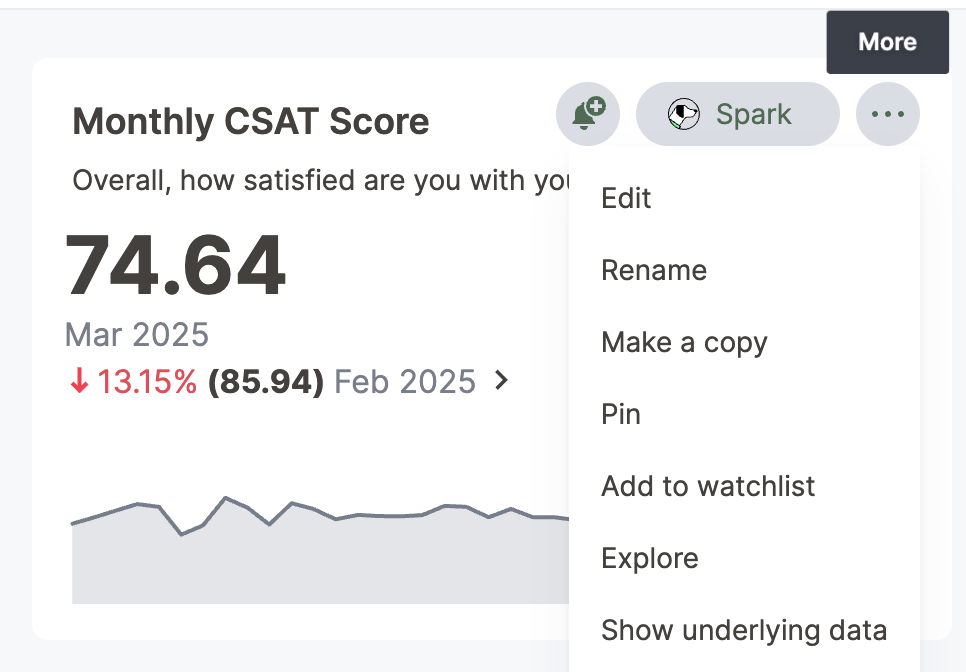
Where to find chart settings now
When editing a chart, look for the icons displayed in the Section area of the chart editing panel.
Each icon opens a different configuration section.
While the available options vary depending on your chart type, you can typically access:
- Chart type – Change how your data is visualized (bar, line, pie, etc.).
- Data settings – Modify measures, attributes, and aggregations.
- Axis settings – Adjust labels, scales, and formatting.
- Style and formatting – Update colors, legends, labels, and display preferences.
- Advanced options – Configure additional display or analytical settings, when available.
Instead of opening one large settings panel, you now select the specific icon for the setting you want to adjust.
|  | |
In the Layout panel, you see the x and y axes of your chart. Depending on the chart, you have access to additional configurations like slice, size with color, size, and more. |  | |
In the Column panel, you can rename the columns, change the sort order, and set numeric, percentage, or currency formatting for the measure. You can also change the color used in the visualization, and set up conditional formatting. If the advanced mode is enabled, you can change the aggregation used. |  | |
In the Axis panel, you can rename the axes, change the number format of the value label, and the position of the Y-axis. If the advanced mode is enabled, you can change the format, size and color of the text. You can format the numeric, percentage and currency of the measure, and you can also change the range of the Y-axis, and display axis lines and intervals. |  | |
In the Data label panel, you have various options for displaying, formatting and filtering data labels. |  | |
In the Tooltip panel, you have various options for displaying tooltips, including the columns where you want to have tooltips. If the advanced mode is enabled, you can change the background color, opacity, and border color. You can also change the text format, size and color, of field and value labels. |  | |
In the Legend panel, you have various options for positioning the legend on your chart. |  | |
In the Display panel, you have various display options for your chart, including fitting it to the screen, automatically setting bar widths, and maximum data points. You can also zoom into a specific area of the chart. If the advanced mode is enabled, you can change settings like chart and plotted area background and border colors. |  | |
In the Query panel, you can see the details of the query used to generate your chart. You can click Query visualizer to see how your visualization is generated by displaying the queries, tables, join paths, and fields used. You can also click Query SQL to view the exact SQL query used to generate the chart. |  | |
In the Custom panel, you have the option of adding a custom action to allow your users to take action on the data they find. You can either select an existing action or create a new one. In addition, you can decide where you want the action to appear in your chart. |  |
How to edit a chart using the new interface
Follow these steps to update your chart:
- Open your Dashboard.
- Locate the chart you want to edit.
- Click Edit.
- In the chart editor, review the row of section icons.
- Select the icon that corresponds to the setting you’d like to update.

- Make your changes.
- Click Save to apply updates.


Tip: If you’re not sure which section contains a specific setting, check each icon—settings are grouped logically by function.
Is there a basic or advanced mode?
Some documentation references “Basic” and “Advanced” modes.
In Alchemer Dashboard:
- The current interface includes all previously available functionality.
- Certain advanced configuration options may appear depending on your chart type and data structure.
If you’re unable to locate a specific option, confirm:
- The chart type supports that configuration.
- The underlying data includes the required fields.
- You have the necessary permissions to edit the chart.
What stayed the same?
While the layout has changed, you can still:
- Change chart types
- Edit measures and attributes
- Modify aggregations
- Customize formatting
- Adjust axes and labels
- Configure advanced display options
The functionality hasn’t been removed—only reorganized to improve usability and clarity.
Frequently asked questions
Can I switch back to the old settings UI?
No. The previous settings interface is no longer available following the latest upgrade.
Are the existing help articles being updated?
Yes. We’re updating the help documentation and screenshots to reflect the new interface. Until those updates are complete, you can use this article as a reference for navigating the redesigned settings experience.
I can’t find a setting I used before. What should I do?
First, review each section icon in the chart editor. Settings are now grouped by category rather than displayed in a single panel.
If you’re still unable to locate a feature, contact Alchemer Support with:
- The chart type you’re using
- A description of the setting you’re trying to configure
- A screenshot of your current view (if possible)
We’re happy to help you find what you need.