Geo charts show data on a map by location. There are three geo charts that let you visualize geographical data in Alchemer Dashboard: geo area, geo bubble, and geo heatmap charts. These geo charts can display six types of geographical data, depending on territory:
- Country
- State
- County
- Zip code
- Point (latitude/longitude)
- Other sub-nation regions (for international countries)
Alchemer Dashboard now supports maps for all countries. See the complete list in Openstreetmap supported countries.
Previously, Alchemer Dashboard supported the following geo chart capabilities:
- Visualize data at the country level for multiple countries in one chart.
- Visualize data at a higher level of detail (state, city, zip code) within one country at a time.
Now, Alchemer Dashboard supports the following capabilities:
- Visualizations comparing subdivisions of multiple countries in a single visualization. For example, if a selected column contains data from cities in the United States and Mexico, all data would be displayed on a single visualization.
- Visualizations displaying multiple levels of subdivisions within a country, rather than just city and zip code.
- Visualizations representing zip code as an area within a region, rather than a point on a map.
To improve the accuracy of your Search, we recommend appending the country name, or adding a reference to the country that the data is referring to. To append the country name, you can use a formula such as concat (region, ', ' , country).
Displayed geo data
Here is a table that shows which GeoType data can be displayed using which geo chart type.
| GeoType | Data Type | Geo chart type | Notes |
|---|---|---|---|
Country | VARCHAR | Geo area (default), geo bubble, geo heatmap | Can also be regions. |
County | VARCHAR | Geo area (default), geo bubble, geo heatmap | Only for counties in the United States. |
Latitude (point) | VARCHAR or DOUBLE | Geo bubble (default), geo heatmap | Must use both latitude and longitude columns. |
Longitude (point) | VARCHAR or DOUBLE | Geo bubble (default), geo heatmap | Must use both latitude and longitude columns. |
State | VARCHAR | Geo area (default), geo bubble, geo heatmap | Only for states in the United States. |
Zip code | VARCHAR | Geo bubble (default), geo heatmap | Many different countries. |
Other sub-nation regions | VARCHAR | Geo area (default), geo bubble, geo heatmap | The display depends on the type of administrative region. |
For data to display in geo charts, your administrator must configure it as geographical data. If you don’t get an expected map visualization, contact your administrator so they can configure the system correctly.
See also:
Geo chart customizations
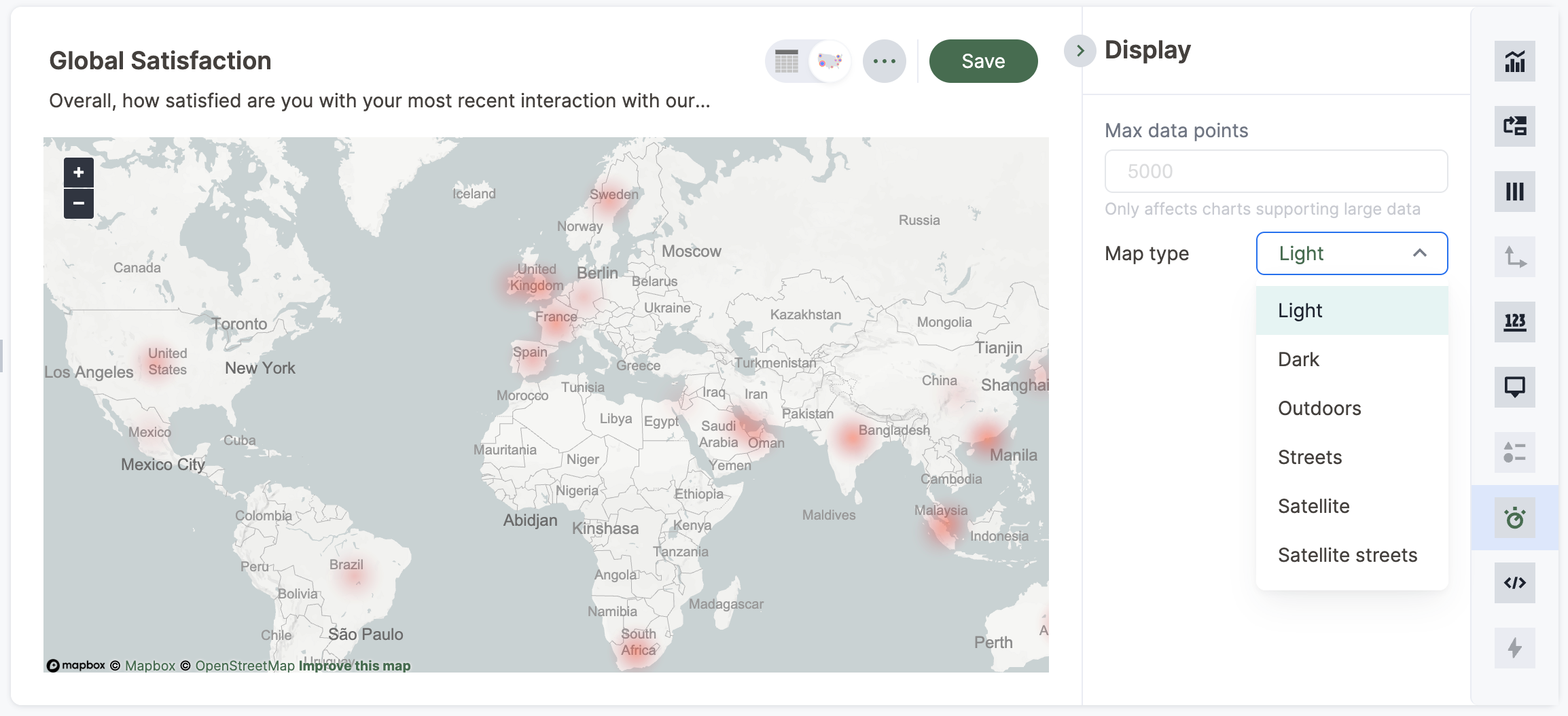
Geo charts allow you to customize the map display by changing the Map type.
To customize the Map type, follow these steps:
1. Navigate to any geo chart that you have edit privileges for.
2. Select the Display tile in the chart builder menu.
3. Click the Map type dropdown menu, and select one of the options: Light, Dark, Outdoors, Streets, Satellite, or Satellite Streets. The default is Light.
For example, view the Light (default), Outdoors and Dark map types:

Limitations
Geo charts do NOT support conditional formatting.
Geo bubble charts
Geo bubble charts, like bubble charts, display the value of the measure through the relative size of the bubble. Zip code data is a good choice for geo bubble charts.

To paint a geo bubble chart, your search must include a geographical column, or a latitude and longitude pair.
See also the full introduction to Geo charts and specifics of working with them.
Geo chart customizations
Geo charts allow you to customize the map display by changing the Map type.
To customize the Map type, follow these steps:
1. Navigate to any geo chart that you have edit privileges for.
2. Select the Display tile in the chart builder menu on the left side of your screen.
3. Select the Map type dropdown menu, and select one of the options: Light, Dark, Outdoors, Streets, Satellite, or Satellite Streets. The default is Light.
For example, view the Light (default), Outdoors and Dark map types:

Limitations
Geo bubble charts do NOT support conditional formatting.
Geo heatmap charts
Geo heatmap charts display the value of the measure through the depth of color of the area. Use geo heatmap charts to see the relative value or density of a measure by location (for example, "sales" relative to "customer zip code").

To use the geo heatmap chart, your search must include a geographical column, or a longitude and latitude pair. Alchemer Dashboard supports geographical visualizations for many countries.
See also the full introduction to Geo charts and the specifics of working with them.
Geo chart customizations
Geo charts allow you to customize the map display by changing the Map type.
To customize the Map type, follow these steps:
1. Navigate to any geo chart that you have edit privileges for.
2. Select the Display tile in the chart builder menu on the left side of your screen.
3. Select the Map type dropdown menu, and select one of the options: Light, Dark, Outdoors, Streets, Satellite, or Satellite Streets. The default is Light.
For example, view the Light (default), Outdoors and Dark map types:
Change chart gradient

You can now choose multiple colors to define a gradient in charts that support gradients — geo heatmap, geo area, heatmap, and treemap charts. You can control the low, mid, and high values, and numerical value points to customize the gradient.
To define the gradient in a geo heatmap, geo area, heatmap, or treemap chart, follow these steps:
1. Open your chart, select the Column tile in the chart builder menu.
2. Navigate to the Gradient section to define the colors for the Min, Mid, and Max values using the color selector dropdowns.

4. In the text boxes below the color selectors, you can define the min, mid, and max points numerically. You can define the min point, max point and mid point as a narrow range if you would rather only see gradients for the top values of your measure.
5. (Optional) Select Flip Color to switch the high and low value colors.