Dashboards
Dashboards are collections of your related Charts, in the form of charts and tables, and your headline metrics.
You can pin charts and tables to any Dashboard which you created, and those that have been shared with you with the Edit privilege. When you create a Dashboard, you can share it with other people with either the View or Edit privilege. Dashboards are interactive, allowing you to perform actions like drilling down on Charts, filtering, excluding values, and exploring Charts.
Using Filters
You can filter a Dashboard to only see the relevant data.
To filter a Dashboard, follow these steps:
1. Select the Edit button at the upper right of the Dashboard. If this button is grayed out, you do not have edit privileges for the Dashboard. To resolve this, contact your administrator or the creator of the Dashboard.
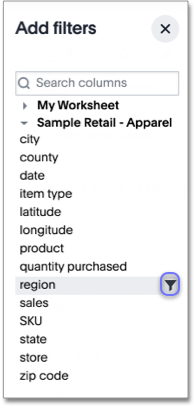
2. In the top menu bar, select Add filters. Note that you need access to the underlying data source to be able to filter a Dashboard.
3. In the columns list, select the Add filter icon next to the column you would like to filter on.
4. Under Default values > Include, select the values to include in your Chart.
6. Select Apply.
See Dashboard Filters for more information.
Getting to Insights
You can leverage Dashboards to gain insights into your data in several ways. Chart Explorer, Alchemer Dashboard's AI-guided exploration of Charts and headline metrics within Dashboards, provides you with valuable suggestions on how to explore and understand your data. The feature suggests ways to Chart questions that are relevant to many other users, and it takes into account your own Alchemer Dashboard history. Use Chart Explorer to filter an Chart or headline, run comparisons, replace items in a Chart, or add additional elements to a Chart.
Dashboards always have the most current data. If you follow a Dashboard or a KPI, you can schedule regular updates on that Dashboard or pinned headline, and track its changes.
You can also drill down on any Chart in a Dashboard. See Drilling down.
Drilling down
When you drill down, you can see more information about the data within your search. You can drill down into a datapoint to get a finer grained view of that datapoint and the data behind it. Move easily from a general view of your information to a more specific representation of the data behind a datapoint at a click. For example, in a revenue by department search, you may notice that your clothing department has the highest revenue. You can drill down on clothing by product name to find out which products contribute to those high sales. There is no limit to how deep you can drill down.
You can drill down from within the Chart Explorer view in a Dashboard. This allows you to use the back button to go back one step at a time, and to see the Chart fill your screen.
Presenting
Use the Present feature to present a Dashboard as a live slideshow with the latest data. You can answer questions instantly during your presentation by editing a Chart, drilling down, filtering a visualization, or using Chart Explorer.
To present a Dashboard, click the More icon at the upper-right corner of the Dashboard, and select Present.
Edit a Dashboard
To edit a Dashboard, you must enter Edit mode to make changes to the Dashboard. This includes adding filters, adding tabs, and changing the layout. You do not need to enter edit mode to change the name of the Dashboard or Dashboard visualizations.
To enter edit mode, select the Edit button at the upper right of the Dashboard. If this button is grayed out, you do not have edit privileges for the Dashboard. To resolve this, contact your administrator or the creator of the Dashboard.
Dashboard Tabs
You may want to separate your Dashboard into multiple tabs, grouping certain visualizations together in each tab. For example, you may have a Sales Dashboard that contains top-level KPIs and more detailed charts. You can create a tab for the top-level KPIs for executives to view, and a tab for the more detailed charts that managers need to monitor. To add tabs, select the Edit button at the upper right of the Dashboard, and select + Add tab in the top menu.

To learn more about Dashboard tabs, refer to tDashboard tabs.
Undo, redo, and reset buttons
As you work with Dashboard visualizations, you may want to undo or redo an action. Use the in-product undo, redo, and reset buttons to reset or go back or forward 1 step each time you make a change in a search, saved Chart, or Dashboard visualization (for example, when you drill down, or sort). These buttons appear to the left of the Explore button in a Dashboard visualization. Note that the reset button is only available for saved Charts and visualizations; it resets the Chart to its last saved state.
Downloading
You can download a Dashboard as a PDF, or as a scriptable TML file for migration to another environment.
To download a Dashboard, click the More icon at the upper-right corner of the Dashboard, and select Download as PDF. You can download the whole Dashboard, or just certain visualizations.
To export a TML file, select the More icon at the upper-right corner of the Dashboard, and select Export TML. You can export Dashboard and the underlying data source, or Worksheet, or just the Dashboard.
Sharing Dashboards and Charts
You can share Dashboards and Charts with other Alchemer Dashboard users and groups, and send them a notification email.
See Overview of Sharing.
Charts
Charts are saved search results. When you search on your data, your results appear in the form of a table or chart, depending on your search. There are many different types of charts. Alchemer Dashboard picks the chart type that best fits your search, but you can choose another chart type if you like. When you’re done customizing a search result, you can save it as a Chart, and pin it to a Dashboard. The Chart always contains the latest data.
You can easily change a saved or pinned Chart by customizing it to suit your needs.
Change Visualizations
- Change between table and chart representation by toggling between the table and chart elements.
- Change chart type by selecting a different visual type from the chart catalog.
Configuring Charts
Configure the chart by selecting the gear element.