Alchemer Mobile (ApptentiveKit) on iOS has four levels of customization available for the interactions it presents:
- Theme setting
- UIAppearance overrides
- UIKit extensions
- Overriding
InteractionPresenter
Note about WCAG / ADA Accessibility Compliance
Alchemer's default UI theme for Android and iOS SDK 6.0 and above is WCAG 2.0 AA and WCAG 2.1 compliant. Alchemer cannot guarantee compliance for customized UI themes. If you customize any UI elements in our iOS SDK 6.0 and above, please use https://webaim.org/resources/contrastchecker/ to confirm that your text colors, selector colors, and icon colors meet or exceed WCAG 2.0 AA and WCAG 2.1 minimum contrast levels.
Themes
For apps where cross-platform consistency is less of a concern, or where a developer wants to apply their own visual customization, the theme property on the Apptentive instance can be set to .none (this should be completed before calling the register(with:completion:) method):
Apptentive.shared.theme = .noneBy default, ApptentiveKit adopts a cross-platform theme for Surveys and Message Center that includes dark blue navigation bars with white text, and hides most of the default UITableView decorations. The colors of other interface elements mostly use system defaults, and system fonts are used throughout. This correspondes to a the theme property being set to .apptentive.
Internally, these themes use a combination of the next two customization options: UIAppearance and the Apptentive UIKit extensions (found in UIKit+Apptentive.swift).
UIApperance
Some aspects of the Alchemer Mobile (ApptentiveKit) interactions can be customized using familiar UIAppearance properties. The properties that the Alchemer Mobile (ApptentiveKit) theme customizes via UIAppearance overrides include segmented controls, navigation bars, toolbars, bar button items, and table views.
The customizable Alchemer Mobile (ApptentiveKit) interactions are all contained in a subclass of UINavigationController called ApptentiveNavigationController, which can be used to scope appearance changes to only apply to Alchemer Mobile (ApptentiveKit) customizable interactions:
UITableView.appearance(whenContainedInInstancesOf: [ApptentiveNavigationController.self]).backgroundColor = myBackgroundColorApptentiveNavigationController also has a static property to determine the status bar style:
| Property | Description | Default | Alchemer Mobile Theme |
|---|---|---|---|
preferredStatusBarStyle | The foreground color for status bar interface elements | .default(black foreground color) | .lightContent (white foreground color) |
Alchemer Mobile-Specific Appearance Settings
For customizing dialog-style interactions (Prompts and the Love Dialog), the SDK uses UIAppearance properties.
DialogView Appearance Settings
The dialog appearance can be customized by accessing the appearance proxy for the DialogView class. To target properties in either Love Dialog or Prompts (formerly Notes) interactions, use the EnjoymentDialogViewController and/or TextModalViewController as appearance containers, respectively.
To match the standard UIAlertController in its alert style, the DialogView uses a UIVisualEffectView for its background. This means that the backgroundColor property will appear as an underlay behind the visual effect view. To avoid this, you can turn off the effect as follows:
UIVisualEffectView.appearance(whenContainedInInstancesOf: [DialogView.self]).effect = .none| Property | Description | Default |
|---|---|---|
| The background color of the dialog view. | .white |
titleTextColor | The color of the title label’s text. | .label |
messageTextColor | The color of the message label’s text (Prompts only). | .label |
titleFont | The font used for the title label. | System headline font |
messageFont | The font used for the message label (Prompts only). | System footnote font |
headerImage | An image placed along the top of the dialog view. The image will be scaled to fit the width of the dialog and the height will be calculated based on the image’s aspect ratio. | nil |
cornerRadius | The radius of the dialog’s corners. | 15 |
buttonSpacing | The spacing between adjacent buttons, intended for use when a border is added to the buttons. | 0 |
buttonInset | The amount by which the group of buttons is inset from the edges of the dialog and the text above the buttons. | .zero |
separatorsAreHidden | Whether the separators between adjacent buttons are hidden. | false |
separatorColor | The color of the separators, if shown. | .clear |
DialogButton Appearance Settings
The DialogButton class draws the buttons in the dialog. By default, the buttons cover the entire corner (for Love Dialog) or row (for Prompts) of the dialog
If you are adding a border or corner radius to dialog buttons, we recommend hiding the separators and setting the inset and spacing on the DialogView to create some visual space between multiple buttons and between the buttons and the edges of the dialog.
You can separately style the “yes” and “no” buttons in the Love Dialog (by using the YesButton and NoButton classes) and the dismiss and other buttons in Prompts (by using the DismissButton and InteractionButton classes).
| Property | Description | Default |
|---|---|---|
backgroundColor | The background color of the button. | .clear |
titleFont | The font to use for the button title. | System body font |
cornerRadius | The radius of the button corners. For a capsule shape (where the corner radius is half of the button height), set a value of -1. | 0 |
borderWidth | The width of the button’s border. A value of zero hides the border. | 0 |
borderColor | The color of the button’s border. | .clear |
UIKit Extensions
Alchemer Mobile (ApptentiveKit) extends a number of UIKit classes with Alchemer Mobile-specific static properties that can be used to change the appearance of nearly every interface element. For example, to change the color of a text input (UITextField or UITextView) border, you would add the following code to your app:
UIColor.apptentiveTextInputBorder = .darkGrayNote about WCAG / ADA Accessibility Compliance
Alchemer's default UI theme for Android and iOS SDK 6.0 and above is WCAG 2.0 AA and WCAG 2.1 compliant. Alchemer cannot guarantee compliance for customized UI themes. If you customize any UI elements in our iOS SDK 6.0 and above, please use https://webaim.org/resources/contrastchecker/ to confirm that your text colors, selector colors, and icon colors meet or exceed WCAG 2.0 AA and WCAG 2.1 minimum contrast levels.
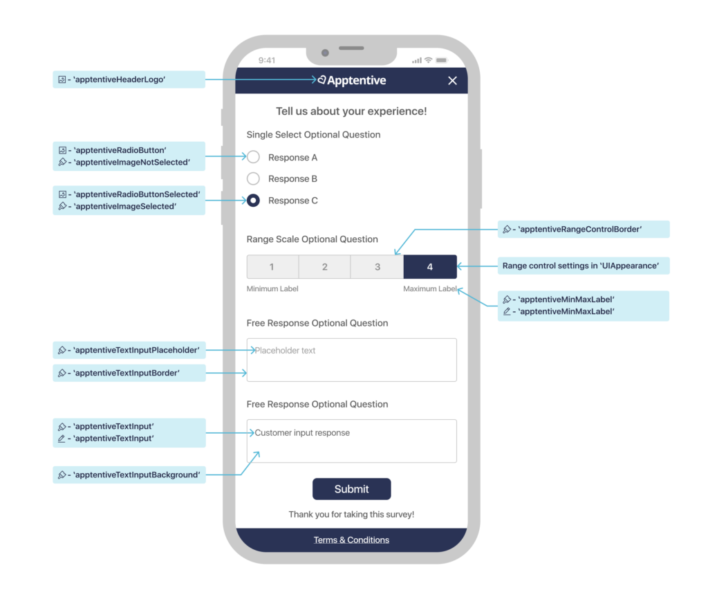
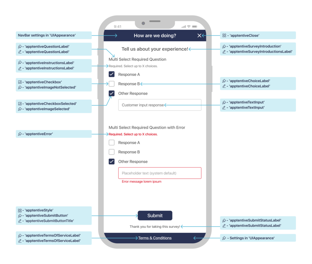
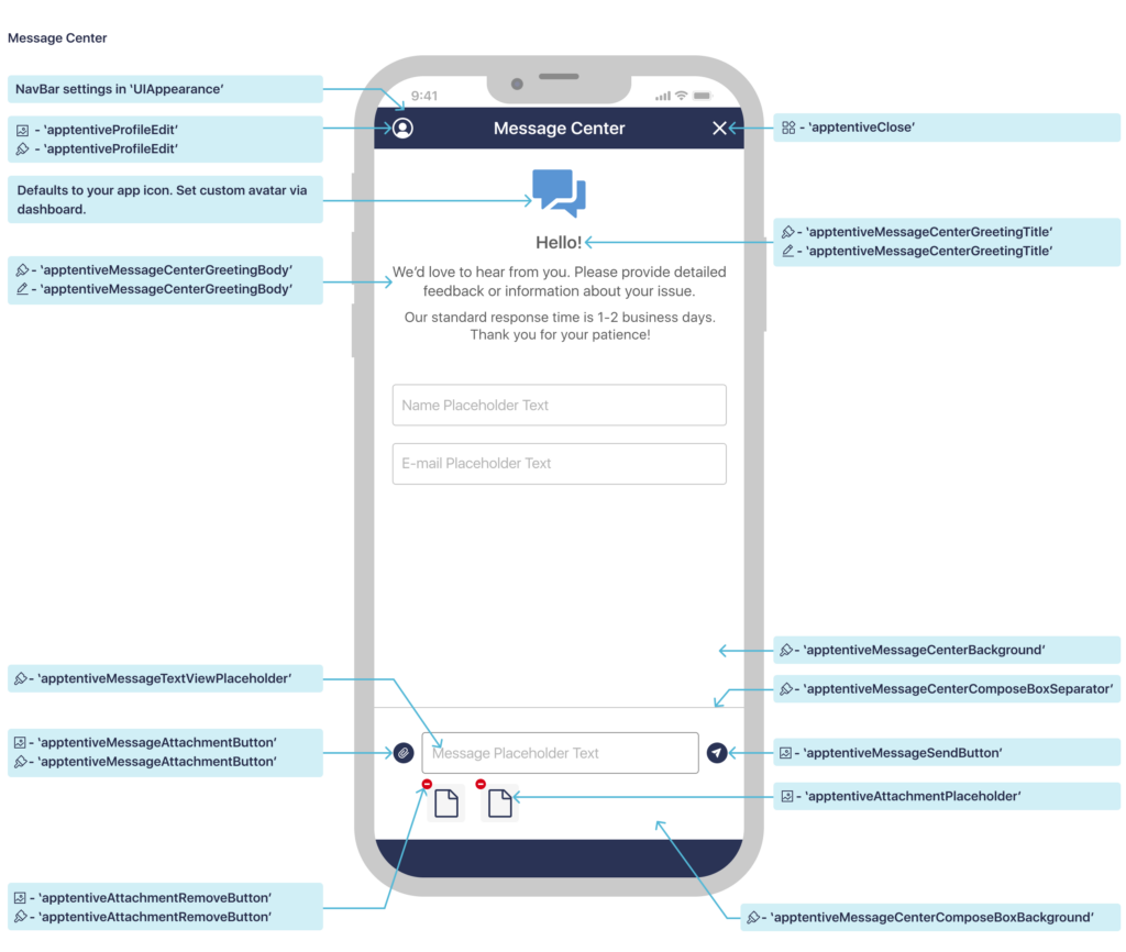
Illustrations of UIKit Extension Properties
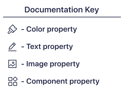
The images below illustrate what each property affects in Message Center and Surveys. Colors, Fonts and Images are indicated by the small icon next to the property name.
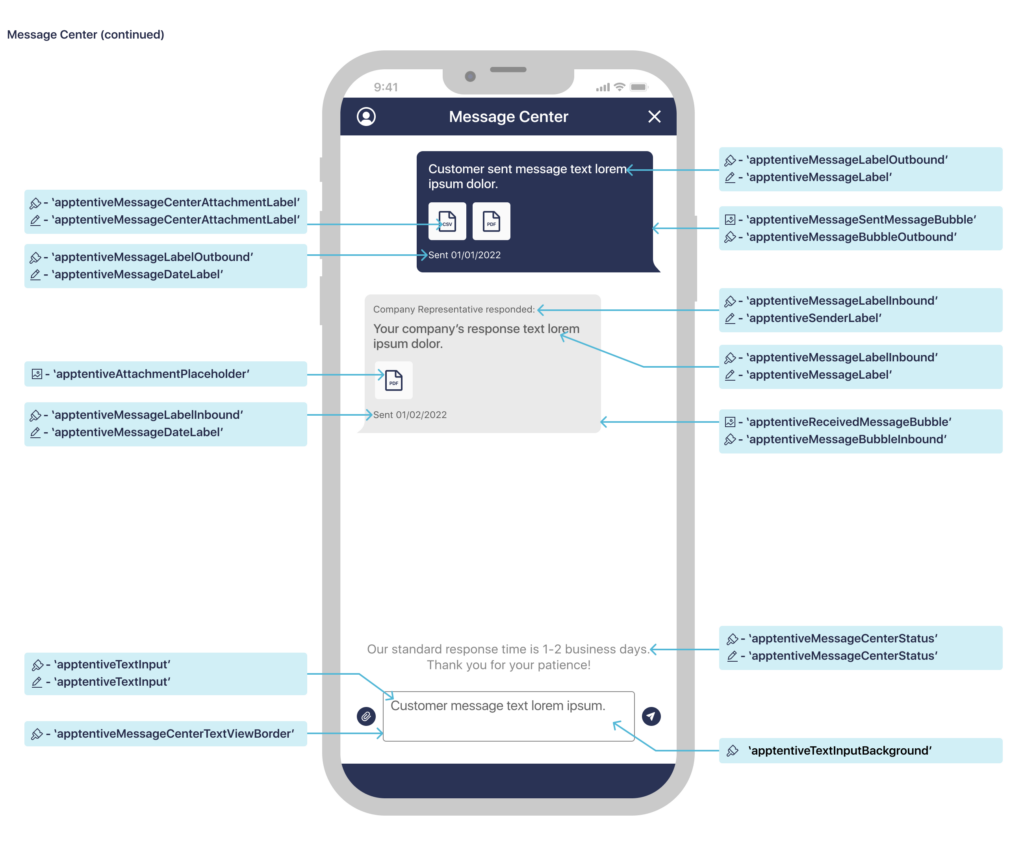
List of UIKit Extension Properties
The following is a list of UIKit classes for which Alchemer Mobile (ApptentiveKit) has style properties, what each property is used for, and its value using both the .none and .apptentive theme.
While the theme property must be set before calling register(with:completion), you can change the values below at any time. However if you change them while an interaction is visible on screen, it may behave unpredictably.
UITableView.Style
| Property | Description | Default | Apptentive Theme |
|---|---|---|---|
apptentive | The style of table view used for surveys | .insetGrouped(iOS 13+) or .grouped (iOS 11–12) | .grouped |
UIModalPresentationStyle
| Property | Description | Default | Apptentive Theme |
|---|---|---|---|
apptentive | How Message Center and Surveys are presented over other view controllers | .pageSheet (allows interactive dismissal on iOS 13+) | |
UIBarButtonItem
| Property | Description | Default | Apptentive Theme |
|---|---|---|---|
apptentiveClose | Bar button item used to dismiss Message Center or a Survey | System .close (iOS 13+) or system .cancel (iOS 11–12) | xmark SF Symbol |
apptentiveProfileEdit | Bar button item used to edit the profile in Message Center | person.crop.circle SF Symbol | Same |
UIButton
| Property | Description | Default | Apptentive Theme |
|---|---|---|---|
apptentiveStyle | The outline style for the submit button in Surveys | .pill (corner radius is equal to half the height) | .radius(8) (corner radius is 8 points) |
UIImage
| Property | Description | Default | Apptentive Theme |
|---|---|---|---|
apptentiveMessageAttachmentButton | The image for the button used to attach an image or file to a message | paperclip.circle.fill SF Symbol | Same |
apptentiveMessageSendButton | The image for the button used to send a message | paperplane.circle.fill SF Symbol | Same |
apptentiveSentMessageBubble | The background image for a sent message |  Resizable, using 9 point top and left insets, and 18 point bottom and right insets, rendered as template Resizable, using 9 point top and left insets, and 18 point bottom and right insets, rendered as template | Same |
apptentiveReceivedMessageBubble | The background image for a received message |  Resizable, using 9 point top and right insets, and 18 point bottom and left insets, rendered as template Resizable, using 9 point top and right insets, and 18 point bottom and left insets, rendered as template | Same |
apptentiveAttachmentPlaceholder | The placeholder image for a yet-to-be-downloaded attachment | Same | |
apptentiveAttachmentRemoveButton | The image for a button used to remove an attachment from the draft message | minus.circle.fill SF Symbol | Same |
apptentiveHeaderLogo | An image that can replace the navigation bar’s title view in Surveys. Recommended size is 200 × 44 points. | None | None |
apptentiveRadioButton | The accessory image for an unselected answer to a single-select survey question | circle SF Symbol | Same |
apptentiveCheckbox | The accessory image for an unselected answer to a multi-select survey question | square SF Symbol | Same |
apptentiveRadioButtonSelected | The accessory image for the selected answer to a single-select survey question | smallcircle.fill.circle.fill SF Symbol | Same |
apptentiveCheckboxSelected | The accessory image for a selected answer to a multi-select survey question | checkmark.square.fill SF Symbol | Same |
UIColor
| Property | Description | Default Light/Dark | Apptentive Theme Light/Dark |
|---|---|---|---|
.apptentiveMessageCenterTextViewBorder | The border color to use for the message text view | 555555 | 858585 |
.apptentiveMessageCenterAttachmentButton | The color to use for the attachment button for the compose view for message center | 0000FF | 2A3355 |
.apptentiveMessageTextViewPlaceholder | The color to use for the text view placeholder for the compose view for message center | AAAAAA | AAAAAA |
.apptentiveMessageCenterStatus | The color to use for the status message in message center | 3C3C43 EBEBF5 | 3C3C43 EBEBF5 |
.apptentiveMessageCenterGreetingBody | The color to use for the greeting body on the greeting header view for message center | 3C3C43 EBEBF5 | 5D5D5D C4C4C4 |
.apptentiveMessageCenterGreetingTitle | The color to use for the greeting title on the greeting header view for message center | 3C3C43 EBEBF5 | 5D5D5D C4C4C4 |
.apptentiveMessageBubbleInbound | The color to use for the message bubble view for inbound messages | 555555 | EAEAEA C4C4C4 |
.apptentiveMessageBubbleOutbound | The color to use for the message bubble view for outbound messages | 007AFF 0A84FF | 2A3355 40566B |
.apptentiveMessageLabelInbound | The color to use for message labels for the inbound message body | FFFFFF | 5D5D5D 4A4A4A |
.apptentiveMessageLabelOutbound | The color to use for message labels for the outbound message body | FFFFFF | FFFFFF E1E1E1 |
.apptentiveQuestionLabel | The color to use for labels in a non-error state | 000000 FFFFFF | 5D5D5D C4C4C4 |
.apptentiveInstructionsLabel | The color to use for instruction labels | 3C3C43 EBEBF5 | 858585 C4C4C4 |
.apptentiveChoiceLabel | The color to use for choice labels | 555555 | 5D5D5D C4C4C4 |
.apptentiveError | The color to use for UI elements to indicate an error state | FF3B30 FF453A | D46363 DC9696 |
.apptentiveRangeControlBorder | The border color to use for the segmented control for range surveys | 000000 | 5D5D5D C0C0C0 |
.apptentiveSurveyIntroduction | The color to use for the survey introduction text | 000000 FFFFFF | 5D5D5D C4C4C4 |
.apptentiveTextInputBorder | The color to use for the borders of text fields and text views | AAAAAA | C0C0C0 |
.apptentiveTextInputBackground | The color to use for text fields and text views | FFFFFF 000000 | FFFFFF 212121 |
.apptentiveTextInput | The color to use for text within text fields and text views | 000000 EBEBF5 | 858585 C4C4C4 |
.apptentiveTextInputPlaceholder | The color to use for the placeholder text within text fields and text views | 3C3C43 EBEBF5 | 858585 C4C4C4 |
.apptentiveMinMaxLabel | The color used for min and max labels for the range survey | 808080 | 808080 |
.apptentiveGroupedBackground | The color used for the background of the entire survey | F2F2F7 000000 | FFFFFF 212121 |
.apptentiveSecondaryGroupedBackground | The color used for the cell where the survey question is located | FFFFFF 1C1C1E | FFFFFF 212121 |
.apptentiveSeparator | The color to use for separators in e.g. table views | 3C3C43 545458 | FFFFFF 212121 |
.apptentiveImageSelected | The color to use for images in a selected state for surveys | 007AFF 0A84FF | 5A95D4 94A8B8 |
.apptentiveImageNotSelected | The color to use for images in a non-selected state for surveys | 007AFF 0A84FF | C0C0C0 C0C0C0 |
.apptentiveSubmitButton | The background color to use for the submit button on surveys | 007AFF 0A84FF | 2A3355 40566B |
.apptentiveSubmitLabel | The color to use for the survey footer label (Thank You text) | 000000 FFFFFF | 000000 FFFFFF |
.apptentiveTermsOfServiceLabel | The color to use for the terms of service label | 007AFF 0A84FF | FFFFFF E1E1E1 |
.apptentiveSubmitButtonTitle | The color to use for the submit button text color | FFFFFF | FFFFFF |
.apptentiveMessageCenterBackground | The color to use for the background of Message Center. | FFFFFF | FFFFFF 212121 |
.apptentiveAttachmentRemoveButton | The color to use for the button that deletes the attachment from the draft message. | FF3B30 FF453A | D46363 DC9696 |
.apptentiveMessageCenterComposeBoxBackground | The color to use for the compose box for Message Center. | FFFFFF | FFFFFF 212121 |
.apptentiveMessageCenterComposeBoxSeparator | The color to use for the compose box separator. | D3D3D3 | D3D3D3 |
.apptentiveUnselectedSurveyIndicatorSegment | The color to use for survey indicator segments in branched surveys when not selected. | 808080 | D6D6D6 |
.apptentiveSelectedSurveyIndicatorSegment | The color to use for survey indicator segments in branched surveys when selected. | 007AFF 0A84FF | 2A3355 5995D3 |
UIFont
| Property | Description | Default | Apptentive Theme |
|---|---|---|---|
apptentiveMessageCenterGreetingTitle | The font to use for the greeting title for message center | System headline font | Same |
apptentiveMessageCenterGreetingBody | The font to use for the greeting body for message center | System body font | Same |
apptentiveMessageCenterAttachmentLabel | The font to use for attachment placeholder file extension labels | System caption1 font | Same |
apptentiveQuestionLabel | The font used for all survey question labels | System body font | System callout font |
apptentiveTermsOfServiceLabel | The font used for the terms of service | System footnote font | Same |
apptentiveChoiceLabel | The font used for all survey answer choice labels | System body font | System callout font |
apptentiveMessageLabel | The font used for the message body in message center | System body font | Same |
apptentiveMinMaxLabel | The font used for the min and max labels for the range survey | System caption2 font | Same |
apptentiveSenderLabel | The font used for the sender label in message center | System caption2 font | Same |
apptentiveMessageDateLabel | The font used for the message date label in message center | System caption2 font | Same |
apptentiveInstructionsLabel | The font used for the instructions label for surveys | System caption1 font | Same |
apptentiveSurveyIntroductionLabel | The font used for the survey introduction label | System subheadline font | Same |
apptentiveSubmitLabel | The font used for the survey footer label (Thank You text) | System headline font | Same |
apptentiveSubmitButtonTitle | The font used for the submit button at the end of surveys | System headline font | Same |
apptentiveTextInput | The font used for the multi- and single-line text inputs in surveys | System body font | System callout font |
Overriding InteractionPresenter
As a final customization option (short of forking ApptentiveKit itself), your app can subclass ApptentiveKit’s InteractionPresenter class and set theinteractionPresenter property on the Alchemer Mobile (ApptentiveKit) instance to an instance of your subclass.
Apptentive.shared.interactionPresenter = MyInteractionPresenter()This can be useful, for example, to customize the Love Dialog or Prompts interactions, since the UIAlertController class used by Alchemer Mobile (ApptentiveKit) is not customizable.
Your InteractionPresenter subclass can override one or more of the following methods, which will be passed a view model with the properties and methods necessary to implement the interaction:
presentEnjoymentDialog(with:)(for Love Dialog interactions)presentMessageCenter(with:)presentSurvey(with:)presentTextModal(with:)(for Prompts interactions)
Your override method should create a suitable view controller (using the view model to configure it) and present it, for example by calling the presentViewController(_:completion:) method.
If you use a different method of displaying your interaction view controller, be sure to override dismissPresentedViewController(animated:) to handle the programmatic dismissal of your view controller.
Because of their complexity, for Message Center and Survey interactions we strongly recommend starting with a copy of the code in the “Default UI” group (“List UI” for Surveys) under each interaction’s group in the Alchemer Mobile (ApptentiveKit) Xcode project.
While we will make a strong effort to maintain API compatibility with current view models, you should expect the view model API to potentially have breaking changes when Alchemer Mobile (ApptentiveKit) minor version number changes.