Starting a Presentation
To start a presentation, follow these steps:
- Select Dashboards on the top navigation bar.
- Select a Dashboard from the list of Dashboard by clicking its title.
- In the open Dashboard, select the more options menu (ellipses icon).
- Select Present.
- Alchemer Dashboard displays the Dashboard in full screen. If the Dashboard has multiple tabs, the presentation includes a title slide for each tab before presenting visualizations in the tab.
To navigate through the slides of the presentation, use the left and right arrow navigation keys on your keyboard, or the left and right arrow buttons in the upper-right corner of the presentation.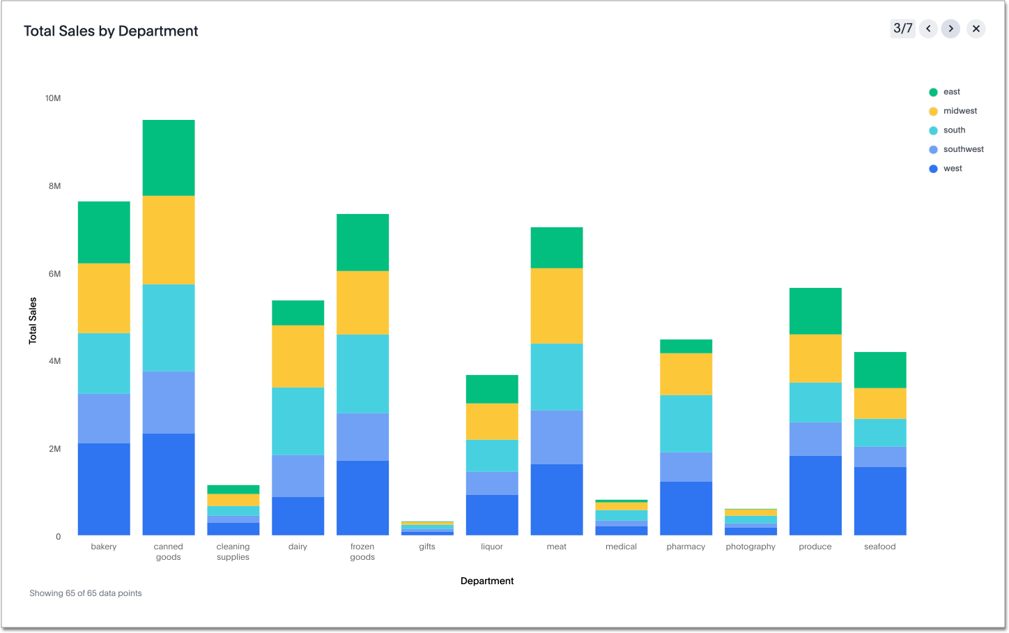

Presentation Navigation Controls
The presentation navigation controls enable you to effectively run the presentation.
Hover over the upper-right corner of the presentation to see the navigation control options:
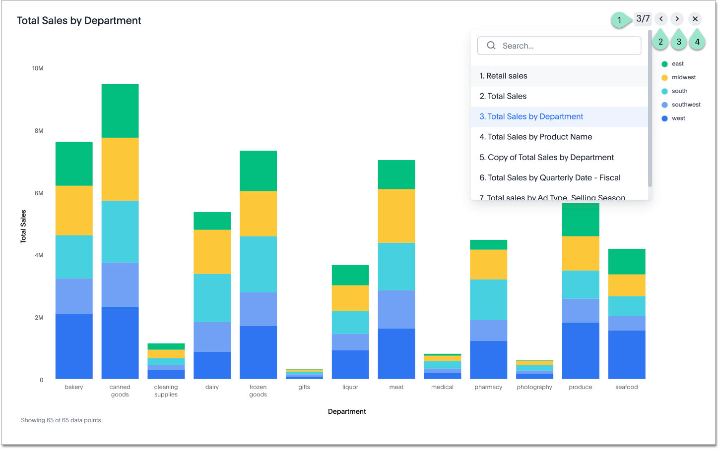
- Select the slide number to expand the list of visualizations, and navigate directly to a different slide.
- Select the left arrow to go to the previous slide.
- Select the right arrow to go to the next slide.
- Select the x to end the presentation.
Presenting Dashboard
While in presentation mode, you can easily explore each visualization.
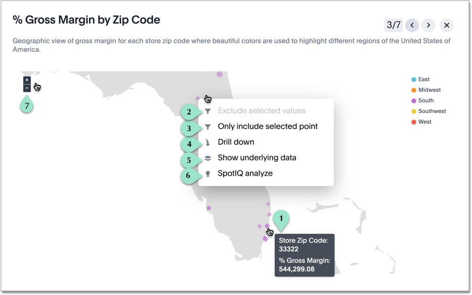
Consider the following Dashboard actions:
| Legend | Action |
|---|---|
1. |
You can see the tooltip information about each element of the visualization as you hover the cursor over that area of the presentation. |
2. |
By left-clicking, you can open a drop menu where you can change filtering to Exclude selected values. |
3. |
Similarly, you can apply a filter to Only include selected values or Only include selected point. |
4. |
You can drill down to see more information about the columns used in search. Left-click and select Drill down from the menu. |
5. |
To show underlying data in more detail, left-click and select Show underlying data from the menu. |
6. |
To run AI on a visualization, left-click and select AI Highlights from the menu. |
7. |
Depending on the chart type, you can perform the chart-specific actions. For geographic maps, you can zoom and pan the map. |